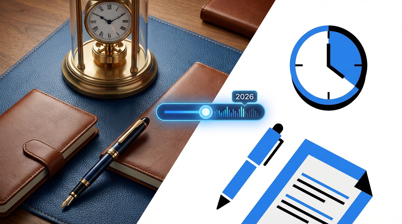
Most people still talk about skeuomorphism vs flat design like it is iOS 6 vs iOS 7. That debate is dead. The real tension in 2026 is between emotion and efficiency: interfaces that feel physical, friendly, and a bit nostalgic vs interfaces that are brutally clean, minimal, and fast to parse.
The short answer: in 2026, almost everything that ships at scale is still flat or “flat-plus” (flat with subtle depth and motion). Full-on skeuomorphism is rare, but its DNA is everywhere: neumorphism, soft UI, glassmorphism, tactile micro-interactions, and 3D icons. If you are building a serious product, you default to flat design with selective skeuomorphic cues where clarity, affordance, or trust actually need the help.
What we really mean by skeuomorphism and flat design in 2026
Most articles still define these like it is 2013. The industry has moved on, but the labels stayed.
- Skeuomorphism: Digital UI that mimics real-world objects or materials. Leather calendars, metal knobs, book pages, realistic shadows, 3D switches, embossed buttons.
- Flat design: Minimal, 2D interface with simple shapes, solid colors, low or no gradients, minimal shadows, and heavy reliance on iconography and typography.
- Flat-plus (what many products actually use): Flat base, with restrained depth: soft shadows, subtle gradients, meaningful motion, and layered surfaces (think current iOS, Material You, Fluent Design).
The pure forms are rare. Nobody sane ships full leather-bound notes apps anymore, and almost nobody ships completely shadowless, monochrome flat UI either. Everything is hybrid.
In practice, “skeuomorphism vs flat” in 2026 is a spectrum from emotional, physical metaphors to abstract, utilitarian layouts.
Where the terms still matter
You still see these words used in a few contexts:
- Brand and marketing sites: Design studios, creative tools, high-end hardware brands talk about skeuomorphic details or flat minimalism as part of their “visual language.”
- Design systems: Teams clarify if they are leaning toward flat or tactile visual styles when defining tokens, elevation rules, and icon sets.
- UX audits: Critics accuse products of being “too flat” when users miss affordances, or “too skeuomorphic” when the UI feels childish or dated.
Why skeuomorphism fell out of favor (and what survived)
Old school skeuomorphism died for several reasons. Some were aesthetic, some were practical.
- Visual clutter: Heavy textures, gloss, and faux materials overload the eye. Every screen feels busy, and users tire quickly.
- Responsiveness and performance: Dense graphics and bitmap textures do not scale cleanly. They bloat asset sizes, slow load times, and age poorly across form factors.
- Maintenance cost: Updating a flat icon set is trivial compared with re-rendering detailed 3D-style assets for new resolutions, color schemes, and layouts.
- Internationalization: Real-world metaphors do not travel well. A paper address book icon or a floppy disk save icon makes less sense to younger or non-Western users.
- Brand maturity: As products matured, they needed a cleaner, longer-lasting visual identity instead of themed textures and “cute” illusions.
Skeuomorphism solved first-time UX for new users, but punished power users who needed speed, density, and clarity over theatrics.
Yet skeuomorphism did a few things right, and those ideas never went away.
Affordance and “what does this do”
Physical metaphors tell you what you can touch. A raised button begs to be pressed. A slider track with a handle invites dragging. Skeuomorphism made affordances obvious.
Flat design, when taken too literally, removed these cues. When everything is a rectangle, people guess where to click. That is how we ended up with ghost buttons nobody recognized, or icon-only toolbars with zero labels.
Many 2026 interfaces quietly reintroduce tactile hints:
- Elevated primary buttons with soft shadows.
- Cards that “lift” on hover or tap.
- Interactive regions with clear boundaries and layered hierarchy.
Emotional trust and familiarity
Early digital products needed to convince people that virtual tools could replace physical ones. Mimicking leather, paper, and metal was one way to make things less abstract.
We no longer need leather calendars, but the underlying principle still matters: some categories still benefit from warmth and familiarity.
- Finance and banking: Subtle physical cues in cards, wallets, and transaction receipts can add a sense of reality and trust.
- Health and wellbeing: Softer surfaces, skeuomorphic sliders, and textures reduce the “cold dashboard” feeling.
- Learning and kids apps: Objects that look like toys or books guide interaction more than flat icon grids.
The visual excess of old skeuomorphism died; the psychological value of familiarity did not.
Flat design: why it still dominates in 2026
Flat design took over because it solved different problems: maintainability, clarity at scale, and performance on a wide range of devices.
| Flat Design Strength | Impact on Real Products |
|---|---|
| Simpler visuals | Less noise, easier to scan dashboards and admin panels. |
| Vector friendly | Sharp at any resolution, easy to adapt to new devices. |
| Systematic | Easier to build a design system with consistent tokens. |
| Accessible color use | Clear contrast and fewer texture-based cues. |
| Performance | Smaller asset sizes, better load times on weak connections. |
Typical 2026 flat / flat-plus stack
Most serious products in 2026 use some variation of:
- Material You inspired surfaces: Layered cards, meaningful elevation steps, big typography.
- Subtle gradients: Very soft color transitions to avoid “too sterile” interfaces.
- System-native motion: Reduced but meaningful transitions, focused on continuity (modals, navigation transitions, list reordering).
- Iconography: 2D icons with consistent stroke weight and corner radius, slight rounding for a friendlier look.
Most teams have settled on this flat-plus middle ground because it supports:
- Design systems that survive multiple product generations.
- Theming for light/dark mode, plus high-contrast accessibility themes.
- Custom branding on top of shared components.
Flat won not because it was beautiful, but because it was sustainable and predictable across devices, teams, and years.
Trends in 2026: the real battle is nuance, not extremes
The old binary question “skeuomorphic or flat?” is lazy. The harder, real question in 2026 is: how much physicality, and where?
1. Tactile minimalism: skeuomorphism on a diet
Instead of leather and brushed metal, you see:
- Soft shadows that imply touch, not realism.
- Neumorphism-inspired cards, but with improved contrast and accessibility.
- Micro 3D in icons: slight depth on key actions, rewards, or error states.
This version of skeuomorphism does not pretend the screen is a real object. It simply hints that parts of the UI can be touched, dragged, or toggled.
2. Motion as the new metaphor
Animation carries most of the weight that textures used to carry.
- Buttons depress on tap, then spring back.
- Panels slide from edges in ways that explain the app’s spatial model.
- Reorderable lists show physical-like inertia and friction.
Instead of making a button look like a real button, the interaction feels like a real button press. The metaphor lives in the motion model, not the static pixels.
3. AI tools and generated skeuomorphism
AI design tools now spit out “glossy 3D icons” or “hyper-realistic UI themes” in seconds. This makes more skeuomorphic experimentation cheap, which sounds good until you see the results:
- Inconsistent visual metaphors across screens.
- Heavy reliance on effects that tank performance on low-end hardware.
- Lack of alignment with product goals; visuals exist because the model thought they looked “nice.”
This is where a human designer with some taste and real product experience still matters. The tool can generate texture and depth. The human needs to decide when to strip that back.
4. Hardware convergence: AR, VR, and spatial computing
On flat screens, full skeuomorphism is overkill. In spatial computing and AR, 3D metaphors are natural again:
- Virtual keypads that look and behave like physical ones in AR glasses.
- 3D dashboards in VR that resemble equipment, panels, or consoles.
- Tools that mimic hand tools or instruments so users can guess how to use them without a tutorial.
Skeuomorphism is resurfacing in spatial interfaces because reality is the baseline again. The problem is consistency: when the same product exists on phone, web, and headset, some design teams try to drag 3D metaphors onto flat screens and end up with bloated, toy-like UIs.
Where skeuomorphism still makes sense in 2026
There are situations where flat minimalism hurts clarity, and skeuomorphic cues clearly help.
Onboarding and low-tech audiences
If you are targeting people who are not comfortable with abstract icon grids, some physical reference is still useful.
- POS systems in retail or hospitality that mimic cash registers and ticket printers.
- Public kiosks with big, obvious buttons and panels that look like physical controls.
- Senior-focused apps with clear, raised buttons and real-world metaphors for actions.
Flat design ignores user intuition that comes from the physical world. Skeuomorphism acknowledges it.
Tools where precision and feedback matter
In domains where users perform fine-grained adjustments, physical metaphors can improve control and reduce mistakes:
- Audio mixing tools with faders, knobs, and meters that respond like hardware.
- Color grading panels that mimic real dials and wheels, with fine-tuned motion curves.
- Drawing tools that show brush thickness, pressure, and texture as if on a desk.
Here the metaphor is not decorative. It encodes an interaction model that professionals already know from hardware gear.
Playful experiences and brand expression
For communities, games, or passion-product sites, a bit of skeuomorphism can build character:
- Community badges with a coin or medal feel.
- Gamified progress meters that look like real gauges.
- Event landing pages with physical-ticket or poster aesthetics.
The risk is overdoing it. Many brands go from tasteful depth to cartoonish kitsch in one release.
Use skeuomorphism where it changes behavior or comprehension, not just because it “looks cool” in a Dribbble shot.
Where flat design still wins, decisively
Some areas favor flat interfaces almost by definition.
Dense information interfaces
Admin dashboards, monitoring tools, IDEs, and analytics platforms are about density and comprehension:
- Tables with hundreds of rows.
- Charts, logs, and alerts in one view.
- Complex navigation with nested sections.
Here, heavy shadows and fake materials just get in the way. Users want:
- Clear vertical rhythm.
- Predictable spacing.
- Readable typography.
- Simple but clear selection and focus states.
Flat, disciplined design serves that better than any retro texture.
Responsive and multi-platform UI
When your UI needs to work on:
- Phones from low-end Android to premium devices.
- Tablets and desktops.
- Different input types: touch, mouse, keyboard, stylus.
Heavy skeuomorphism complicates the grid and scaling behavior. Flat systems with a clear 4/8-pixel spacing system, a few elevation levels, and simple shapes migrate far more gracefully.
Accessibility and clarity
Textures and complex shading can hide contrast problems. Flat interfaces:
- Rely more on solid colors and clearly defined focus outlines.
- Encourage consistent use of contrast ratios that work across conditions.
- Are easier to theme for high contrast or colorblind users.
Texture and realism can still be accessible, but the margin for error is slimmer. Most teams do not test enough to justify that risk.
Practical guidance: choosing a direction in 2026
If you are building or redesigning a product in 2026, the choice is rarely “pure skeuomorphic” or “pure flat.” The better question is: where on the spectrum do you sit, given your constraints?
Step 1: Clarify product type and user mindset
Ask a few blunt questions:
- Is this tool used daily or occasionally?
- Are the users experts, novices, or a mix?
- Is the product emotionally loaded (money, health, relationships) or mostly functional?
Rough guidance:
- Daily pro tools: Bias toward flat, with minimal skeuomorphic cues for key interactions.
- Occasional or hesitant users: Allow more physical metaphors and tactile hints.
- Emotion-heavy domains: Layer in warmth through depth, motion, and softer surfaces, not just color.
Step 2: Set constraints on visual complexity
Before any concept work, define limits:
- Maximum number of elevation levels you allow.
- Number of corner radii you accept in the system.
- Rules for gradients and shadows (where allowed and how strong).
Example rule set:
- 3 elevation levels only: base, raised card, modal.
- One standard corner radius, one “pill” for special elements.
- Shadows allowed on interactive surfaces only, within defined blur and offset ranges.
This keeps skeuomorphic cues in check and protects performance and consistency.
Step 3: Use skeuomorphism for affordance, not decoration
When you feel the urge to add realism, ask:
- Does this make it more obvious what the user can do?
- Will someone who has never seen this UI guess the right action faster?
- Does the effect give feedback or hint state, or is it just style?
If the answer is no, you are probably adding noise.
Step 4: Test flat-first, then add depth only where failure occurs
A practical workflow:
- Design each screen in a flat, minimal state with no shadows or gradients.
- Run quick usability checks: where do users miss buttons, misinterpret hierarchy, or misclick?
- Add elevation, contrast, or motion only to those trouble spots.
- Iterate on those cues until the confusion drops.
This avoids the typical trap: starting with “pretty” and then trying to retrofit usability.
How major players are handling this in 2026
You can ignore blog thinkpieces. Look at what big ecosystems actually ship.
Apple: “flat-plus” with cozy physical hints
Apple moved from heavy skeuomorphism to stark flat, then crept back into softness:
- Rounded rectangles everywhere, with soft shadows and layered panels.
- Complex glass-like effects in some contexts (e.g., blurred backgrounds), but not on primary navigation.
- Micro animations that feel physical: bouncing lists, springy toggles.
They retain a slight physical flavor while staying maintainable across macOS, iOS, iPadOS, and watchOS.
Google / Material You: abstract but layered
Material You continues to push:
- Bold color schemes tied to user themes.
- Clear elevation levels, but with simple, consistent shadows.
- Limited skeuomorphic gestures, mostly in motion and state transitions.
It is flat at rest, with a structural sense of depth only when needed to show hierarchy or focus.
Microsoft: Fluent Design as middle ground
Fluent has gradually moved away from the heavy acrylics of its early days toward a cleaner, more neutral base:
- Subtle blur and translucent panels in controlled contexts.
- Flat iconography with slightly softened corners.
- Controlled use of shadows and motion for focus and navigation.
All three ecosystems converge around the same idea: flat base, subtle skeuomorphic cues in motion and elevation, heavy realism avoided.
Common mistakes when mixing skeuomorphism and flat in 2026
Teams still repeat the same errors, just with new buzzwords.
Inconsistent depth language
One part of the UI uses hard, sharp shadows; another uses almost invisible ones. Some buttons float; others are flat. Users cannot rely on elevation to mean anything.
Fix this by:
- Defining elevation tokens with specific visual recipes.
- Mapping those tokens to semantic meaning: background, content, overlay, critical overlay.
Unnecessary realism that competes with content
Designers add fake lighting, 3D badges, or textured backgrounds that fight with text and data for attention. It looks impressive in a single shot, but exhausting in daily use.
Mitigation:
- Reserve higher visual complexity for empty states, marketing pages, or achievement moments.
- Keep core workflows visually restrained.
Ignoring performance on low-end devices
Excessive blur, transparency, and complex shadows tax GPUs and drain batteries. Users on older or mid-tier hardware feel the lag long before anyone on a designer MacBook Pro notices.
Concrete steps:
- Test on a low-tier Android device and an older laptop as part of the design review.
- Provide a “reduced effects” or “battery saver” visual mode where heavy effects are stripped.
Implications for web hosting, communities, and tech products
If your world is web hosting dashboards, community platforms, and developer-focused tools, the tradeoffs skew heavily in one direction.
Hosting dashboards and control panels
cPanel, Plesk, custom admin tools: users are often technical, task-focused, and in a hurry.
Design priorities:
- Clear grouping of resources: servers, sites, databases, DNS records.
- High information density without visual chaos.
- Fast perception of status: healthy, warning, error.
Flat or flat-plus design with a disciplined use of shadows works best. Some subtle skeuomorphic touches might help:
- Modal overlays that clearly “sit above” content.
- Buttons for destructive actions that feel more tactile, reinforcing the sense of weight.
- Realistic progress feedback for backups and deployments, but controlled.
Anything more ornate will age poorly and slow down power users.
Developer tools and SaaS platforms
For dev dashboards, CI/CD pipelines, and observability tools:
- Skeuomorphic gauges and faux-console effects tend to wear thin.
- Flat charts, crisp typography, and rigorous spacing help users read logs and metrics faster.
- Color and simple motion are usually enough to signal severity and actionability.
Here, skeuomorphism is best restricted to small delights: maybe status icons with a hint of depth, or subtle feedback on drag-and-drop operations.
Online communities and social products
Communities are more emotional than dashboards. Visual character matters.
Flat layouts help with:
- Readability for long discussion threads.
- Consistency across many content types.
- Performance for users on weaker devices.
Thoughtful skeuomorphic cues can help your community feel less generic:
- Badges with gentle 3D, not over-the-top gold trophies.
- Reaction animations that “pop” in a physical way.
- Profile cards with subtle shadows and layering to convey depth of identity.
If your community UI looks like every other flat forum template, a few restrained physical cues can differentiate it without turning it into a toy.
Checklist: choosing between skeuomorphism, flat, or a hybrid in 2026
Use this as a quick decision grid.
| Question | If “Yes” | Recommended Bias |
|---|---|---|
| Do users interact daily and value speed? | Power users, dashboards, dev tools | Flat / flat-plus, minimal skeuomorphism |
| Is the audience non-technical or anxious? | Finance, health, seniors, kids | Hybrid with gentle skeuomorphic cues |
| Is the product heavily branded or entertainment-focused? | Games, creative sites, communities | Hybrid, controlled realism for flavor |
| Is the device mix wide and performance-sensitive? | Global web, low-end Android, shared devices | Flat with light depth, avoid heavy realism |
| Does the task map well to existing physical tools? | Audio, video, drawing, simulation | Skeuomorphic interaction patterns, flat visuals |
If your answers pull you in mixed directions, start flat, then layer only the smallest amount of skeuomorphism where tests show confusion or emotional coldness.
In 2026, the smartest products treat skeuomorphism as a scalpel, not a theme, and treat flat design as structure, not religion.


