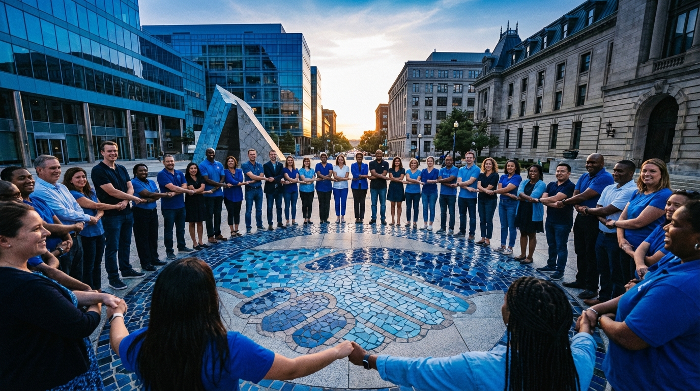
Most community builders obsess over features, growth hacks, and AI widgets, then pick their brand color in the last 10 minutes before launch. I learned the hard way that the opposite is smarter: your color decisions quietly shape who joins, who stays, and who trusts you with their data.
The short version: blue works in communities because users already “trust” it before they read your About page. Years of exposure to banks, SaaS dashboards, operating systems, and social platforms have wired blue to feel stable, calm, and reliable. For a web community, that translates into higher perceived trust, less UI fatigue, and smoother adoption. The catch: you cannot just paint everything blue. The exact shade, contrast, saturation, and how you combine it with typography, white space, and UX patterns will decide if your platform feels credible or just generic and cold.
Why Blue Has Become the Default Trust Color Online
Most people think blue is “trustworthy” because of some deep psychological trait. The truth is more mundane: conditioning and context. Users have stared at blue UIs for decades in contexts where trust mattered: banking, enterprise dashboards, authentication screens, and social networks that store private messages.
When users say a design “feels trustworthy,” they are usually describing familiarity, predictability, and low visual noise. Blue is just the most common wrapper for that experience.
Historic and cultural baggage of blue in tech
Look at the usual suspects:
- Banking and fintech: Chase, PayPal, American Express, Capital One, Stripe (accent), Wise
- Enterprise and B2B: IBM, Microsoft, SAP, Dell
- Social and communication: Facebook, LinkedIn, Twitter (legacy), Skype, Slack (accent)
- Operating systems and tools: Windows, early Mac OS UI highlights, countless admin dashboards
Repeated exposure to blue in “serious” software has created a loop:
| Context | User expectation | Color association |
|---|---|---|
| Banking & payments | Security, reliability, low drama | Medium / dark blue |
| Enterprise dashboards | Stability, structure, longevity | Muted blue + gray |
| Professional social networks | Serious tone, credibility | Blue gradients / flat blues |
| Support portals & docs | Clarity, calm, “someone is in control” | Soft blue accents |
Users carry that baggage into your forum, Discord alternative, or member portal. If your community product leans on blue, they subconsciously map those old feelings onto your new brand.
Why this matters more for communities than for content sites
A blog can run wild with color and get away with it. A community product handles:
- Accounts, passwords, and identity
- Private or semi-private discussions
- Moderation and conflict
- Long-term engagement, not just one-off pageviews
Trust is not a nice-to-have here. Users hold back if the interface feels noisy, aggressive, or unstable. Blue helps in three ways:
- It lowers emotional temperature. Cooler hues are less likely to amplify conflict or anxiety.
- It signals “tool” instead of “ad.” Users are more willing to explore settings, profiles, and deeper features.
- It makes long sessions tolerable. Warm, high-saturation palettes can be visually tiring across hours of reading threads.
In communities, color is not just branding. It is part of moderation, onboarding, and retention, because it directly shapes how “safe” and sustainable the experience feels.
How Blue Affects Trust, Behavior, and Perception in Communities
Now that the halo effect is clear, the more useful question is: what does blue actually do to user behavior in a community interface?
Cognitive load and reading comfort
Communities are text-heavy. You are asking users to read long threads, skim replies, compare arguments, and remember who said what. An aggressive palette makes that cognitively harder.
Blue supports reading comfort when used correctly:
- Background / surface hues: Off-white or very light gray with subtle blue tint feels less harsh than pure white.
- Accents: Links, minor buttons, and notification badges in medium blue are easier on the eye than pure red or electric orange.
- Focus states: Blue focus rings and selection states match OS conventions, so they “disappear” into expectation.
That familiarity reduces micro-friction. Users do not waste attention decoding the interface. They invest it in the conversation.
Emotional temperature and conflict management
Community managers underestimate how much the interface itself can fuel drama. High saturation warm palettes lean toward urgency and aggression. That is useful for e-commerce and marketing, less so for a long argument about infrastructure choices or moderation policy.
Blue pushes emotional tone in three ways:
- Calm framing: Threads about support tickets, conflict resolution, or policy changes sit better in a cool interface.
- Perceived fairness: When moderation tools and flags sit in the same calm blue system as other elements, they look less like punishment and more like process.
- Reduced panic: Alerts that use red text on a neutral or blue-leaning surface stand out clearly without turning the whole UI into a warning light.
The less your UI feels like an emergency broadcast system, the more users will treat disagreements as problems to solve rather than battles to win.
Authority vs friendliness: the trade-off inside “trust”
“Trust” is not one thing. For communities, it breaks into:
- Authority trust: “These admins know what they are doing and will not lose my data.”
- Relational trust: “These people care about members like me.”
Blue leans heavily toward authority trust. That is why banks and compliance tools love it. Your job is to avoid sliding into coldness.
| Design choice | Effect on authority trust | Effect on relational trust |
|---|---|---|
| Dark navy primary + light blue accents | Very high (“serious platform”) | Can feel distant or corporate |
| Soft desaturated blue + warm neutral background | Moderate (“sensible, calm”) | Higher (“welcoming, not stiff”) |
| Electric saturated blue for everything | Low (feels cheap or immature) | Low (overstimulating) |
The trick for community UIs is to keep blue in a supporting role for structure and clarity, then add warmth somewhere: avatars, photography, secondary accents, or typography tone.
Shades of Blue: What Each One Signals in a Community Context
Not all blues are equal. A sloppy choice here can sabotage the whole “trust” angle.
Dark navy blues (#0B172A to #152238)
These work well for:
- Developer or sysadmin communities
- Security, DevSecOps, compliance discussion spaces
- Paid, invite-only communities with a professional angle
Perception:
- Serious, structured, long-term
- High trust in stability, low trust in approachability if used alone
Risks:
- Too much dark navy can feel like a corporate intranet that no one loves but has to use.
- In dark mode, poor contrast choices quickly make content harder to read.
Medium professional blues (#1E5AA8 to #2F80ED)
This is the “SaaS default” range. Good for:
- Public forums for products and open source projects
- Creator communities around tools or learning
- Support communities where clarity matters more than brand flair
Perception:
- Trustworthy, neutral, product-focused
- Moderately warm if combined with soft grays and plenty of white space
Risks:
- You look like every other SaaS help forum if you do not differentiate with typography, layout, or iconography.
Soft, desaturated blues (#A3B9CC to #D6E4F2)
These are better as background and card surfaces than as primary brand colors.
Use cases:
- Highlighting quoted replies or system messages
- Making subtle sections in a dense thread without hard borders
- Creating “calm zones” for help center or onboarding content
Perception:
- Gentle, non-threatening, quiet
- Works well for wellness, mental health, or peer support communities when paired with warmer accent colors
Bright and electric blues (#007BFF, #00A3FF, etc.)
These grab attention fast. They are best used with discipline.
Good for:
- Primary CTAs (“Create thread”, “Post reply”)
- Key focus states, such as selected tabs or active filters
- Links in body text
Risks:
- If everything is electric blue, nothing is. Users lose the priority signal.
- Long-term eye fatigue, especially on bright screens and long sessions.
Pick one blue for structure and one for action, then stop. More than that and you are designing a toy, not a community tool.
Applying Blue Across a Community UI: System, Not Decoration
Color psychology only works when the system is coherent. Random blue accents sprinkled on a messy UI will not magically generate trust.
Defining a usable blue palette for a community product
A sane starting point:
- Primary blue: brand-defining shade for logo, key buttons, main navigation.
- Secondary blue: related but lighter/darker tone for hovers, secondary buttons, and focus states.
- Neutral base: off-white, light gray, or very pale blue backgrounds.
- Alert accent color: red or amber for errors and warnings, used sparingly.
Tie that into a small design token set:
| Token | Use | Example value |
|---|---|---|
| color-primary | Main brand and primary actions | #1F6FD4 |
| color-primary-soft | Hover states, subtle highlights | #E3F0FF |
| color-link | Links in content | #1F6FD4 (with underline) |
| color-focus | Keyboard focus ring | #2F80ED |
| color-bg | Main page background | #F6F7FB |
This kind of discipline builds trust because the interface behaves predictably. Users learn quickly what blue means in your system.
Hierarchies: what “blue” should mean in your community
If blue shows up everywhere without consistent meaning, users stop trusting your signals. A clear mapping helps:
- Navigation blue: “This moves me around the product.”
- Action blue: “This does something immediately (post, save, send).”
- Informational blue: “This gives context or passive information (tooltips, links).”
Try mapping concrete components:
| Component | Color role | User meaning |
|---|---|---|
| Top nav bar | Navigation blue | “This is the spine of the app.” |
| Primary CTA button | Action blue | “This is the safest and most direct next step.” |
| Text links inside posts | Informational blue | “This opens related content without side effects.” |
| System info banners | Informational blue background | “General notice, not an error or threat.” |
Once these are consistent, users gain confidence quickly. They know where to click and what will happen.
Accessibility: where many “trusty blue” UIs still fail
Plenty of platforms talk about trust and then ship color choices that break basic accessibility. That kills trust with any user who has vision differences, and frankly, it affects everyone on bad screens.
Key checks:
- Contrast ratios: Aim for at least 4.5:1 between text and background for normal text, 3:1 for large text and essential icons.
- Links vs plain text: Blue alone is not enough. Add underlines or strong weight for links in body copy.
- Color-independent states: Do not rely solely on blue vs gray to show active vs inactive. Use icons, labels, or patterns.
If someone cannot tell which button is active, the color system is not trustworthy, no matter how nice the gradient looks in a design review.
Platform Types: Matching Blue Strategy to Community Goals
Different community formats benefit from different uses of blue. Copying Facebook’s shade will not fix a product problem.
Support forums and SaaS communities
Goals:
- Reduce churn by answering user questions clearly.
- Encourage peer-to-peer help.
- Project product stability and reliability.
Blue strategy:
- Use a medium professional blue for headers, category labels, and primary actions.
- Keep thread backgrounds neutral with very subtle blue for “accepted answer” or staff replies.
- Use stronger blue to mark “official” content from staff so users can quickly anchor on trusted responses.
Here, blue is part of your support SLA story. If the UI looks stable and calm, users feel more patient and are more likely to browse existing answers before opening tickets.
Creator and membership communities
Goals:
- Make members feel part of a group without scaring off newcomers.
- Support long reading and watching sessions.
- Make payment and account management feel safe.
Blue strategy:
- Use blue for account, billing, and platform-level navigation, not for the entire content area.
- Allow creators and sub-communities to introduce accent palettes inside the main blue frame.
- Keep onboarding flows heavy on blue and neutral tones to emphasize stability when payment info appears.
This blend gives a “platform is safe, people are colorful” message. The frame is stable; the content can vary.
Technical and open source communities
Goals:
- Encourage deep, often opinionated technical discussion.
- Support long reading in threads and code snippets.
- Convey that the project is serious and maintained.
Blue strategy:
- Go slightly darker and desaturated for primary blue to echo terminal and IDE color schemes.
- Use blue sparingly in code areas so syntax highlighting does not clash.
- Highlight maintainers’ posts or RFCs with a quiet blue frame instead of bold color blocks.
Here, blue acts like the console background: something you stop seeing after a while. That is exactly what you want during 30-minute RFC reads.
Health, wellness, and support communities
Goals:
- Signal safety, empathy, and confidentiality.
- Avoid overstimulation or clinical sterility.
- Support sensitive topics over long threads.
Blue strategy:
- Prefer soft, desaturated blues for surfaces and subtle accents.
- Introduce gentle warm touches (muted coral, beige, soft green) in avatars, illustrations, or CTA highlights.
- Avoid harsh dark navies that feel hospital-like or corporate.
Here, blue still carries the trust signal, but warmth carries the human side. Overreliance on cold blue risks making the space feel distant.
Testing Whether Blue Is Actually Building Trust (Not Just Looking “Nice”)
Design teams often stop at “the mockups look clean.” That does not tell you whether blue is improving trust or just meeting designer taste.
Quantitative tests you can run
Track metrics that relate to trust and comfort:
- Onboarding completion: Compare sign-up flows with different accent treatments for key permissions (notifications, data usage).
- First-week retention: See if blue-heavy vs more colorful variants affect return visits and time on site.
- Security-related flow drop-off: Watch conversion through password reset and two-factor setups under different color treatments.
A straightforward A/B test:
- Variant A: Highly saturated blue CTA buttons, neutral backgrounds.
- Variant B: Slightly softer blue CTAs, subtle blue-tinted panels for security and identity sections.
If variant B shows higher completion in sensitive flows (password change, payment updates) without hurting overall engagement, your “trust” palette is doing real work.
Qualitative signals from users
Ask specific questions, not “Do you like the design?”
Useful prompts:
- “If this community had been around for a few months vs many years, which one would you guess from the interface alone?”
- “Which version makes you more comfortable storing personal details, and why?”
- “Which layout feels more ‘argue on Twitter’ vs ‘discuss in a forum’?”
Listen for language that hints at trust:
- “Stable”, “reliable”, “calm”, “serious”, “corporate”, “cold”, “friendly”, “playful”, “hectic”
You want a blend like “serious but not cold” or “calm and friendly” for most community products. If “cold” and “corporate” dominate, your blue system needs warmth or relief.
Color feedback is rarely about hue alone. Users describe how safe they feel exploring, posting, or disagreeing. Those are trust signals, not styling notes.
Common Mistakes When Using Blue to Build Trust
Veteran teams still repeat the same errors around blue, especially when rushing brand refreshes.
Over-branding: flooding the UI with corporate blue
Marketing wants brand presence. That often translates into:
- Blue header
- Blue sidebar
- Blue cards
- Blue buttons
- Blue icons
The result:
- Hierarchy collapses; users cannot tell what matters.
- Long threads become visually exhausting.
- Everything feels like an ad banner instead of a tool.
Hold the line: use blue strongly in only a few structural areas and in primary actions. Leave breathing room.
Cloning big platforms without thinking about context
Copying LinkedIn or Facebook blue is not a strategy. Their trust level does not come from hex codes alone. It comes from years of habit, network effects, and user inertia.
Misfit cloning looks like:
- A small niche forum using near-Facebook blue, triggering “social media drama” expectations instead of “focused community” expectations.
- A privacy-first community mimicking corporate SaaS blue for “credibility,” undercutting its “independent, user-first” promise.
Your color system should fit your brand story:
| Brand story | Better blue strategy |
|---|---|
| Grassroots, community-owned forum | Softer blues plus human photography or illustration |
| Compliance-focused B2B discussion hub | Darker, more formal blues with precise, minimalist UI |
| Indie hacker or builder network | Moderate blue for base UI with accent colors that feel experimental |
Ignoring dark mode and mobile realities
Many teams design their blue palette on a large, calibrated monitor in light mode, then ship it unchanged to phones and dark UIs.
Common issues:
- Blue that looks clean in light mode becomes neon-heavy in dark mode.
- Tap targets that rely on subtle blue-vs-gray contrast disappear in sunlight.
- Focus states are invisible on mobile where “hover” does not exist.
Plan separate but related palettes:
- Dark mode blues should be muted and lean slightly toward gray to avoid glare.
- Accent blue for text and icons in dark mode needs enough contrast to avoid eye strain.
- Active states on mobile should use more than color: underlines, bold labels, or clear icons.
Beyond Color: When “More Blue” Will Not Fix a Trust Problem
At some point, color psychology hits its limit. You cannot paint over broken product promises.
Structural trust issues that no palette solves
If your community struggles with:
- Constant spam and low-quality posts
- Unpredictable moderation and unclear rules
- Frequent downtime or data mishandling
- Manipulative growth tactics (dark patterns in invites, notifications)
No shade of blue will rescue that. Users might feel a bit more comfortable clicking around at first, but long-term trust decays fast once reality contradicts the visual promise.
Color sets expectations. If the experience does not match, the betrayal hurts more, not less.
Where blue can still support real trust-building work
Used honestly, blue can amplify real progress:
- Clear policies: Present guidelines and moderation decisions in calm, well-structured blue UI rather than red alert boxes.
- Transparent updates: Announce outages, incidents, and changes inside consistent info banners, not chaotic mod posts scattered through threads.
- Secure features: Two-factor setup, recovery options, and privacy controls can borrow blue patterns users already trust from other platforms.
Color is not the cause of trust, but it can support the story you are actually living out in the product.
Practical Blueprint: Designing a “Trusted Blue” Community Interface
To make this concrete, here is how you might design a new web community with blue as the trust anchor.
Step 1: Choose the trust posture
Decide what you need to project:
- High authority, moderate warmth: Professional knowledge community, B2B hub.
- Moderate authority, high warmth: Peer groups, support communities, hobby spaces.
Map that to hues:
- Authority-first: darker primary blue, limited saturation, lots of neutral gray.
- Warmth-first: medium or soft blue, slightly warmer neutrals, friendly imagery.
Step 2: Build a minimal color system
Define:
- Primary blue, secondary blue, neutral background, alert colors.
- Roles for each: navigation, primary actions, informational states.
Test quickly with grayscale mockups before adding color. If the UI does not communicate hierarchy without color, blue will not rescue it.
Step 3: Apply blue selectively to trust-critical touchpoints
Prioritize:
- Top-level navigation and account area
- Primary actions (“Create”, “Reply”, “Save”)
- Security and identity-related components (profile, settings, permissions)
Keep content areas and discussion threads quieter, with blue appearing only in links, tags, and subtle highlights.
Step 4: Validate with real users
Run short, targeted tests:
- Ask participants to complete a sign-up, profile edit, and first post while speaking aloud.
- Note words related to trust, comfort, confusion, or anxiety.
- Iterate contrast, saturation, and hierarchy before polishing micro-details.
If users consistently say the interface feels “clear”, “stable”, or “calm”, your blue system is doing its job. If “cold”, “confusing”, or “too much going on” appears often, rework usage, not just hex values.
The goal is not to design a “blue brand.” The goal is to make people comfortable committing time, identity, and opinion to your community. Blue is just one of the cheapest and quietest levers you have.


