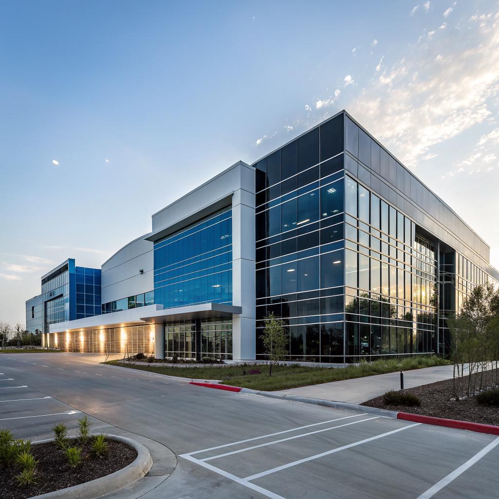
Most people assume their website is the whole “digital office.” Build a good site, pick a decent host, add a live chat, and the job is done. I learned the hard way that it does not work like that. Your site is closer to wall color and layout than the entire building. The real digital HQ is the full experience around it: how people arrive, where they go, how they feel, and why they come back.
Here is the short version of how Dream Painting LLC thinks about that: we treat your digital presence the same way a careful painting contractor treats a physical building. First we inspect the “structure” (hosting, speed, uptime). Then we prepare the surfaces (architecture, content structure, navigation). After that we pick a consistent “palette” (design system, brand voice, tone in your community spaces). Finally we keep maintaining it (patches, updates, logs, and feedback loops). It sounds simple, but done with some discipline, it turns a random collection of pages and channels into a digital HQ that people trust and want to use.
What a “Digital HQ” Actually Is
When I say “digital HQ,” I do not mean a fancy homepage with animations.
A digital HQ is the place online where:
– your visitors land,
– your community talks,
– your team works,
– and your tools connect.
For some companies that is a WordPress site plus a Discord server. For others it is a helpdesk, a customer portal, and a private forum on top of the public site.
If you host websites or run online communities, you already know that web hosting, uptime, and DNS are only part of the story. People do not remember your server stack. They remember if they got lost in your menus, if they felt welcome in your forum, or if they trusted the information on your product page.
A digital HQ is not only where your data lives. It is where your people feel like they “show up to work” or “drop by” your brand.
This is the mindset that guides how Dream Painting LLC builds and “paints” those spaces, even if the name sounds like it belongs on a ladder instead of inside a control panel.
Why a Painting Company Talks About Digital HQs
If your first reaction is “why is a painting company talking about digital HQs at all,” that is fair.
The short answer is that the way a good painter handles a physical building maps strangely well to how a careful tech team should handle a digital one.
This is the rough analogy we use when we work with clients who care about hosting, communities, and tools:
| Physical project step | Digital HQ counterpart |
|---|---|
| Inspect walls, surfaces, structure | Audit hosting, speed, security, content map |
| Repair cracks, sand, mask, prime | Fix broken links, clean IA, set roles, prepare content |
| Choose paints, finishes, colors | Select design system, typography, tone across channels |
| Apply coats with good technique | Build pages, templates, and flows with care |
| Final walk through and touch ups | UX review, bug fix sprint, content polish |
| Maintenance schedule | Updates, backups, monitoring, community moderation |
That might sound a bit stretched. But if you manage servers or communities for a living, you know this pattern. Prep work and boring consistency do most of the heavy lifting. Flashy things come last.
Step 1: Start With the “Foundation” (Hosting, Speed, Reliability)
Before we think about colors or community features, we check what the digital HQ is standing on.
If the base is weak, everything else feels fragile. You have seen this: good interface, nice copy, and then 7 second load times or random 502 errors during busy hours.
For readers on a tech and hosting site, this is familiar territory, but Dream Painting LLC still follows a simple checklist.
Hosting and uptime checks
For every project, we ask a few hard questions up front:
- Is your current host reliable during traffic spikes, or does it throttle?
- Do you have staging environments for safe changes?
- Are backups automatic, versioned, and tested at least once in a while?
- How fast do your key pages load on real devices, not just lab tests?
If a client uses shared hosting with no staging and no real backup story, we push back. Sometimes people expect design work to fix what is actually a hosting issue. That is like asking for premium paint on a wall that is still soaking wet.
You do not fix bad infrastructure with a new color scheme. You fix it with better infrastructure, then paint on top.
We work with whatever tech stack the client prefers, but the principle stays the same: the digital HQ needs a stable home and a predictable build process.
Technical hygiene before polish
Once we know the host and basic uptime are fine, we look at a few technical “hygiene” points:
- HTTPS everywhere with current TLS
- Reasonable caching, not wild guesswork that breaks sessions
- Minimal blocking scripts on first paint
- Clean URL structure, no random query strings for static content
- Logs and metrics: error logs, access logs, basic dashboard
This part is not flashy. It is also where many “nice looking” sites fall apart when traffic grows or when they add a community layer like a forum or membership features.
If you run your own hosting stack, you already know how these details decide if your ticket queue stays small or explodes every Monday morning.
Step 2: Map the Digital Building Before Painting It
After the base is stable, we map the HQ the same way a crew would walk a physical building before painting.
Which rooms exist? Who uses them? Which ones connect?
Content and navigation architecture
Here we treat every page and channel as a room or corridor rather than as an isolated file.
We usually build a simple table to clarify what “lives” where.
| Area | Purpose | Primary visitors | Key questions it answers |
|---|---|---|---|
| Public homepage | Entry point, brand overview | New visitors, search traffic | “What do you do, and should I care right now?” |
| Product / service pages | Explain offers and outcomes | Prospects doing research | “Is this the right solution for my situation?” |
| Docs / knowledge base | Support and self help | Existing users | “How do I solve this problem without a ticket?” |
| Community area (forum, Discord, Slack) | Peer help, discussion, announcements | Power users, regulars | “Where can I talk with others and stay in the loop?” |
| Account portal | Billing, settings, support tickets | Paying customers | “How do I manage my stuff safely?” |
When clients skip this mapping, their digital HQ turns into a maze. Pages overlap, forums repeat docs, and users have to click through five links to do one thing.
You can feel this in hosting panels too. The better ones group actions around real user needs. The rough ones mirror internal systems and make you think like the developer who built them.
Single source of truth
One habit that helps is deciding what each area is responsible for. A few simple rules:
- Documentation is the source of truth for “how to” steps.
- Community is for discussion, help, and sharing, not for critical instructions.
- Marketing pages explain value and outcomes, not low level config steps.
- Account portals are the only place where user data is updated.
We still cross link, of course, but we keep the roles clear. That way a user does not learn one version of a process in a forum and another in an outdated blog post.
Step 3: Choose a Visual and Verbal “Palette”
Once the structure is mapped, we move to what most people think of as “painting”: color, typography, spacing, and voice.
For a digital HQ, this is not only about looking pretty. It is about making the whole experience feel like one place, even when people jump between your site, docs, and community.
Design system basics
We rarely start from a blank canvas. Instead, we build or refine a simple design system that covers:
- Primary and secondary colors, with clear usage rules
- Typography scale for headings, body, UI elements
- Spacing units for padding and margins
- Button styles for main and secondary actions
- Basic layout patterns for key page types
This sounds like designer jargon, but it has real impact for you if you care about hosting and performance.
A clean system:
– reduces CSS bloat,
– makes it easier to theme a knowledge base or forum to match the main site,
– keeps you from shipping ten different button styles over two years.
A design system is a performance tool as much as a branding tool. Fewer unique pieces mean less code and less confusion.
Voice and tone across channels
Visual consistency is only half of it. Your digital HQ also needs a consistent way of speaking.
We usually help clients decide how they want to speak in three main contexts:
- Marketing: clear, confident, a little warm.
- Docs: precise, neutral, unambiguous.
- Community: human, direct, patient.
For example, a support doc might say:
“On shared hosting plans, concurrent connections are limited. To avoid errors during peak time, consider caching and static asset offloading.”
In community chat, the same idea might turn into:
“If you are on the shared plan, watch concurrency. Heavy spikes can hit limits fast. Caching and CDNs help a lot.”
Same content, different tone. Both still feel like the same company, which is what matters.
Step 4: Build Key “Rooms” of the Digital HQ
At this point, we start building or rebuilding the core areas that people use most.
The front door: homepage and top level navigation
For web hosting or digital tools, the homepage has one main job: help the visitor decide if they should go deeper.
We focus on:
- A clear message above the fold: who you serve and what problem you deal with
- Simple primary navigation with no more than one level of nesting
- Obvious paths for main groups: new visitors, existing customers, partners
- Real world examples or screenshots that show the product “in the wild”
Then we support that with performance work: critical content should appear quickly on real mobile devices with average networks, not only on desktop test tools.
The “operations floor”: dashboards and portals
Many digital HQs fall apart inside the private area. The public site looks polished, then the customer logs in and sees a cluttered cPanel clone with twenty icons and no guidance.
When we help on product side, we apply the same painting mindset:
– group controls by real tasks, not by internal system boundaries,
– give each “zone” a clear visual identity,
– limit color and noise so important actions stand out.
For hosting and community platforms, we especially care about:
- Resource usage views that are easy for non experts to read
- Clear error and health messages instead of vague warnings
- Direct links to help content from tricky settings screens
If that area feels clean and predictable, customers are less scared to try new features or change settings, which reduces support load over time.
Step 5: Connect the HQ to Its Community
A digital HQ is not just pages and panels. It is also the spaces around it where people talk, ask questions, and help each other.
For some clients that is Discourse or Flarum. For others it is Discord or Slack. Some still choose classic forums.
Pick a “main hall”
One mistake we see often is having too many semi active channels.
– Public forum
– Private Facebook group
– Discord
– Reddit
– Blog comments
Each has a handful of posts and no real center of gravity.
We usually ask clients to pick one primary “hall” where the community lives, then connect everything to that.
A digital HQ works best when people know where to go by default. The other channels should orbit the main one, not compete with it.
If you run a hosting company, this might mean a Discourse forum linked from the nav bar, with Discord used for live sessions or office hours. Not the other way around.
Bridge between website, docs, and community
We also try to remove dead ends. If someone is reading docs about an error, they should see:
– related threads from the community,
– a clear path to ask for help,
– not just a static article that may or may not match their exact situation.
At the same time, we do not push all questions straight into public chat. Some things still need ticketing, especially when accounts and money are involved. The digital HQ should guide people to the right channel based on the type of issue, not based on what button they happened to see first.
Step 6: Treat Maintenance Like Part of the Job, Not an Afterthought
Any good painting company knows the fresh look on day one is only half the story. Weather, sunlight, and daily use change things fast.
The same happens to a digital HQ.
Technical maintenance
On the tech side, a normal maintenance rhythm covers:
- System and app updates with rollback strategies
- Backup checks and restore tests
- Monitoring alerts for uptime and major errors
- Performance checks on key flows
If you manage hosting, you already do this, but the digital HQ adds another layer: design and content maintenance.
Design and content upkeep
Content and UX also drift over time.
– New features appear with slightly different styles.
– A quick campaign page adds a new font “just for now.”
– Docs grow without a plan and start to contradict.
We encourage clients to schedule “wall checks” on a steady cycle:
| Frequency | What to review | Typical actions |
|---|---|---|
| Monthly | Top 10 pages and flows | Fix obvious issues, update key screenshots |
| Quarterly | Docs structure, navigation, feature pages | Merge duplicates, rewrite confusing sections |
| Yearly | Overall design system and brand fit | Retire old styles, refresh patterns if needed |
Without this, the digital HQ slowly decays. Nothing crashes, but the experience feels older and older, even when the backend stack is current.
Step 7: Use Feedback Loops Instead of Guessing
One habit we borrowed from physical work is the walk through.
At the end of a painting job, a good crew walks the walls with the owner, looks at light angles, and agrees on touch ups.
We try to bring that into digital projects as well.
User walk throughs
Instead of only looking at analytics dashboards, we ask real users to perform a few simple tasks:
- Sign up for a plan
- Find a specific doc
- Ask a question in the community
- Update billing info
Then we watch quietly and take notes. Where do they hesitate? Which link do they try first? Do they scroll back and forth?
This slower, messier data often reveals more than another A/B test. It also reminds the team that the digital HQ is for people who do not know the system as well as the builders do.
Community signals
If you host a community forum, you can also read it as an ongoing usability log.
– Which questions repeat every week?
– Where do people link to docs that are hard to find?
– Which settings confuse even veteran users?
We treat those patterns as “peeling paint” on the walls of the HQ. Not a disaster, but a clear sign that something needs attention.
When we ignore those signs, people grow their own solutions: sticky posts, unofficial guides, and out of date blog posts that search engines keep ranking.
How Dream Painting LLC Fits Into All Of This
You might wonder where a local painting company fits in a conversation that sounds so digital.
The point is not that Dream Painting LLC writes code or runs Kubernetes clusters. The point is that the mindset of careful surface work, prep, and finish maps well to digital work.
A lot of their physical clients in places like Thornton started asking about their online presence. They wanted their websites and customer portals to feel as consistent as the paint on their walls.
That led to a simple idea: treat the digital touchpoints with the same care as the physical ones. A homeowner who feels comfortable working with Dream Painting LLC on a house project should feel the same comfort when they log into a portal, read a FAQ, or leave a review.
If you manage hosting, tools, or communities, you can borrow this approach without touching a paintbrush:
Look at your digital HQ the way a careful craftsperson looks at a building. Structure, prep, finish, and maintenance all matter more than one flashy feature.
Common Mistakes When Building a Digital HQ
You probably already avoid some of these, but they still show up a lot.
1. Confusing “more features” with “better HQ”
It is tempting to add:
– another chat widget,
– another status page,
– another knowledge base category,
– another Slack channel.
More tools do not always help. Often they create more places for things to be half updated. A tighter set of well maintained areas beats an overgrown set of stale ones.
2. Letting marketing and product drift apart
Marketing pages promise one experience. The logged in area and support flows deliver another. Users feel like they moved from a bright showroom into a cluttered back room.
Bringing design and content teams into the same review cycles helps. Even simple shared components between public and private areas can narrow the gap.
3. Ignoring small UX bugs because “people will figure it out”
Broken focus states, inconsistent button behavior, odd redirects after login. Each one is tiny. Together, they tell users that the HQ is put together with loose screws.
People do “figure it out,” but at a cost. They stop trusting that the interface says what it means. At that point, no amount of hosting power on the backend will solve the friction they feel.
What This Means For You If You Work In Hosting Or Tech
If you read a site on web hosting and digital communities, you are probably closer to the “foundation” side than to the “paint” side. You might feel some of this focus on experience is optional or secondary.
I do not think it is.
When someone chooses a host or a digital tool, they make the decision based on:
– past reliability,
– cost,
– features,
– and how understandable and safe the HQ feels.
That last part includes:
– clear dashboards,
– predictable support flows,
– consistent style and language,
– and a community space that feels alive and respectful of their time.
You already put effort into uptime and hardware. Extending that care into the design and structure of the HQ can be the quiet advantage that keeps people from hopping hosts whenever a cheaper coupon appears.
Q & A: Turning Your Setup Into a Digital HQ
Q: I just run a small hosting setup for clients. Do I really need a “digital HQ” mindset?
A: If your clients log in anywhere, read docs, or contact you, you already have a digital HQ. You can ignore it and let it grow in a messy way, or you can shape it on purpose. Even a simple client portal plus a tidy docs area counts. The mindset changes how you design and maintain it.
Q: My infrastructure is strong, but my design is weak. What should I fix first?
A: Do not touch design until your main hosting issues are stable. Once uptime, backups, and performance are under control, start with small UX wins: cleaner navigation, better headings in docs, and a consistent button style. You do not need a full redesign to make the HQ feel more put together.
Q: Our community is spread across multiple platforms. Should we consolidate?
A: Probably. At least pick one primary place and direct new users there by default. Keep other channels only if they serve a clear, different purpose, like real time alerts or niche discussions. Fragmented conversation feels noisy and weakens the sense of a shared HQ.
Q: How often should I “repaint” my digital HQ?
A: Full visual overhauls are rare. Maybe every few years, if your brand or product changes a lot. Instead of big repaints, aim for steady small updates: adjust spacing, clean up wording, retire old clutter, and keep your main patterns fresh. That is closer to regular maintenance than a full redo, and it keeps the HQ feeling current without shocking returning users.
What part of your own digital HQ feels the most “unfinished” right now: the structure, the design, or the community side?


